The Archives Content Search Dashboard
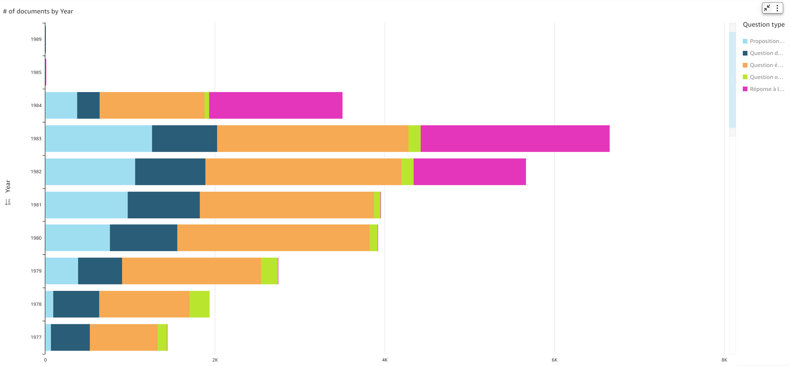
The latest update to the Dashboard is the Archives Content Search Dashboard, which focuses on 38,000 original documents containing European Parliament motions of resolutions, written questions, oral questions and responses to questions from 1958-1984.
A variety of new tools helps citizens and other researchers explore this aspect of European Parliament history, both by making these documents more accessible and showing developments in what Members of Parliament discussed and debated in this time. Let’s take a look at these tools here:
Transport, agricole, emploi: What words appear most frequently in motions for resolutions and parliamentary questions?
The “Top words” interactive word cloud offers an insight into the subjects of European Parliament motions for resolutions and MEP's questions in the European Parliament over the years. Clicking on a word in the “top word” cloud will show all documents that contain that word, in order of the frequency of that word in the document.
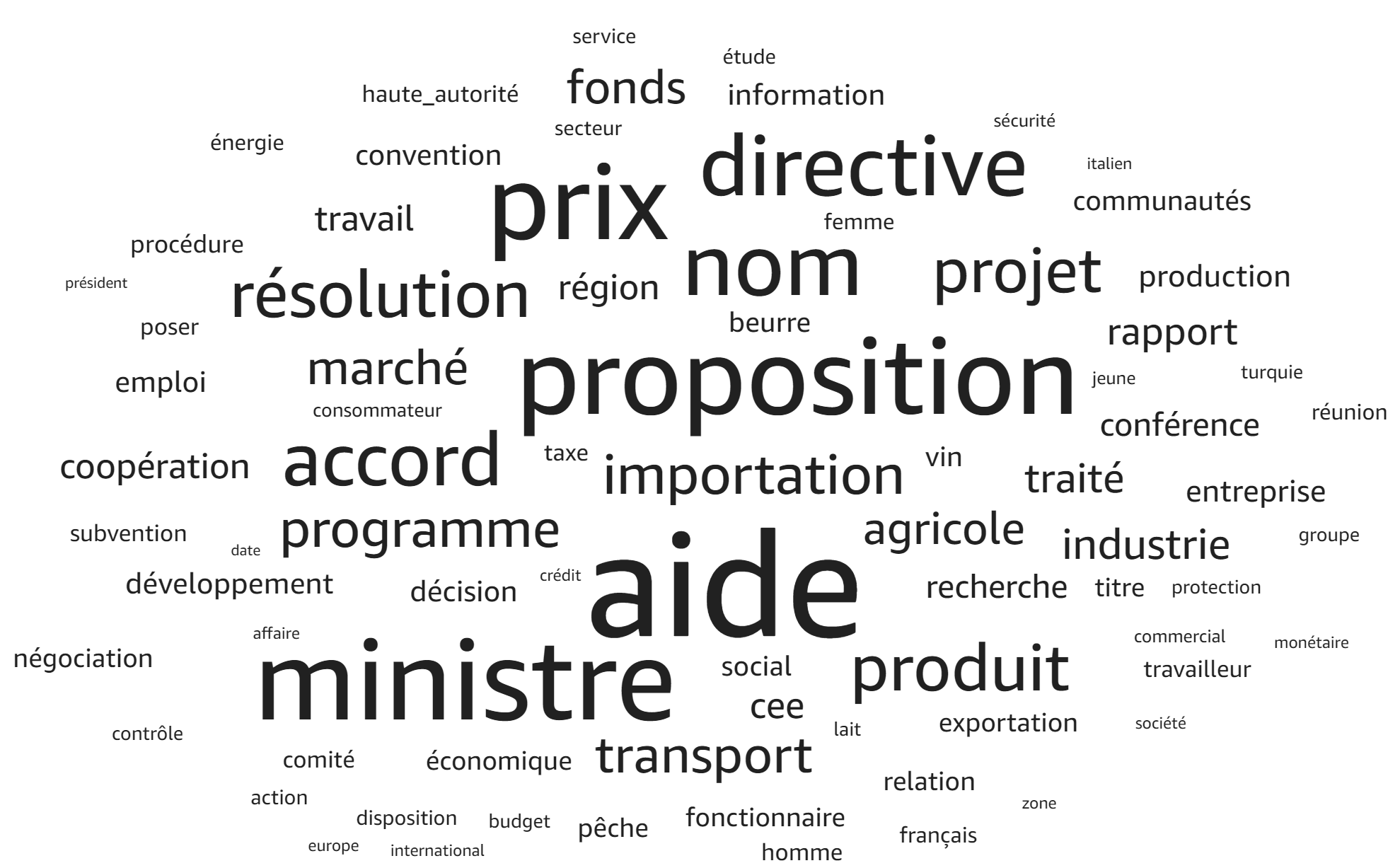 The “Top Word” word cloud: see what words appear most frequently, and find related documents to learn more about the topic from motions for resolutions and parliamentary questions.
Want to search for a particular word? Click Controls > Select Top words (1) and enter the word you want to look for.
What topics have dominated in Parliament?
For a closer look at the development of topics over the years, the “Dominant Topic” feature of the Dashboard is particularly useful. The motions for resolutions and parliamentary questions have been grouped into eleven “dominant topics”, labelled numerically, which have been generated through a statistical analysis of the language used.
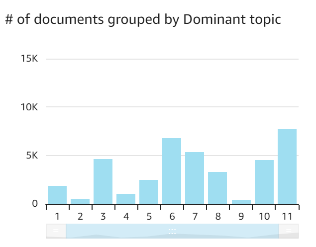
Using statistical modelling, the Archives Content Search Dashboard identifies eleven main topics from 1958-1984. Documents are grouped into topics based on similarities in words used and other connections in the vocabulary.
To see if a document relates to a particular topic, the column “Dominant topic” in the search result list gives the number of the topic that the document is most related to, while “Probability” indicates the probability of the document belonging to that topic.
Want to deep dive into a subject? Find related documents.
It is also now possible to find other motions for resolutions and parliamentary questions related to particular question.
How it works is simple: to find related documents, click Controls > Select action to trigger when clicking a row > Search for similar documents. Now when you click on a document in the search, the Dashboard will generate a list of related parliamentary questions and motions for resolutions. This list is ordered in terms of similarity.
Want to learn more about a topic? See what other MEPs debated and discussed with a particular subject? Search for similar documents using the Archives Content Search Dashboard.
The similarity score is given on the column on the right hand side. Similarity is determined not only by linguistic similarity between the two documents in terms of repeating the same words, but by identifying connections between different words.
For example: an original document and similar documents both have a high frequency of the word ‘agriculture’ will be identified as being related to each other. However, by looking at statistics of the connections between words, even where key terms aren’t used in both the original document, documents may still be considered similar. In our example: the original parliamentary question with a high frequency of ‘agriculture’ may still be considered similar to a document that talks about ‘dairy’ without the use of the word ‘agriculture’, because there have already been many documents that link ‘dairy’ with ‘agriculture’.
Further technical details can be found under the “Process details” tab.
How can I further analyse motions for resolutions and parliamentary questions?
Intertopic distance visualisation
In short, the topics mentioned above have been identified by groups of words that appear together frequently. The two graphs on this page are now trying to answer three questions: what the meaning of each topic is, how prevalent each topic is, and how the topics relate to each other.
On the left is the topic model which shows prevalent a topic is and how the topics relate to each other. In this view, topics are presented as circles on a two-dimensional plane. Their centres are determined by computing the “distance” between topics, that is, how similar documents are based on the terms or words used in them. The graph tells us each topic’s overall prevalence using the areas of the circles. For example, we can see that topic four is quite limited, whereas topic two is less specific in nature, and shares things in common with topics eight, twenty-six and twenty.
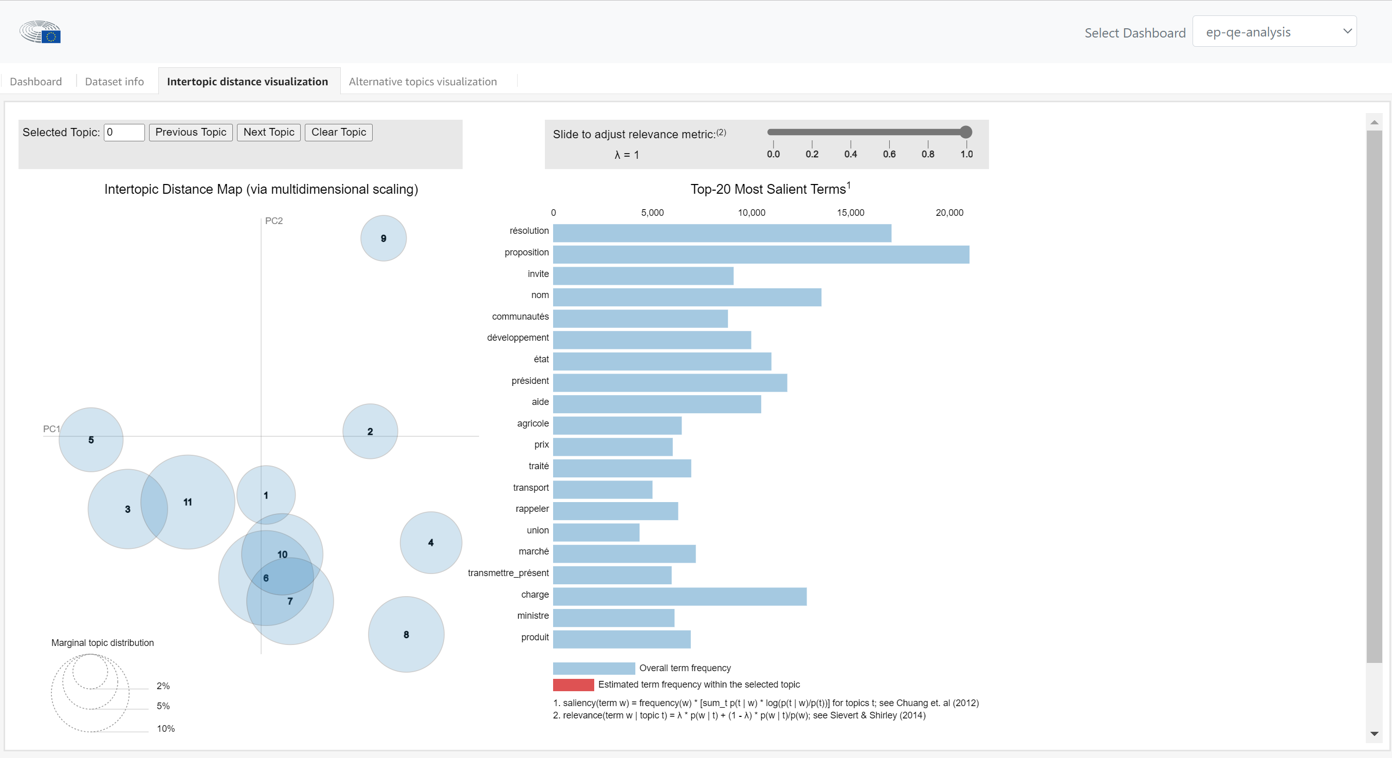 The intertopic distance visualisation displays topics and relevant terms from the Archives Unit documents, identified by a statistical analysis.
On the right hand side, we are looking at what the meaning of each topic is. We can see the top 20 most relevant terms for each topic. The width of the grey bars represent the corpus-wide frequencies of each term, and the width of the red bars represent the topic-specific frequencies of each term. This helps us know how relevant a term is to a specific topic for two reasons: firstly, a high ratio of red to grey indicates a high probability of a term appearing within a particular topic, compared to the probability of this appearing in any document across the corpus. Secondly, you can simply see the probability of this term occurring in a document of a topic, just by the absolute width of the red.
The slider allows you to change the value of the relevance metric. It adjusts the relevance of a term in relation to the corpus, and the topic. While '1' here indicates the frequency of a term relative to 100% of the corpus of documents, we might identify terms more specific to a topic by bringing it down to '0', that is, just within this topic.
If you want to look at the documents related to a topic, you can return to the search function on the dashboard. Under dominant topic, you can select the number of the topic. With topic four, for example, we can already see a theme: one question concerns the price of margarine, another a minimum price for fruits and vegetables and another, the production of cereal in Italy.
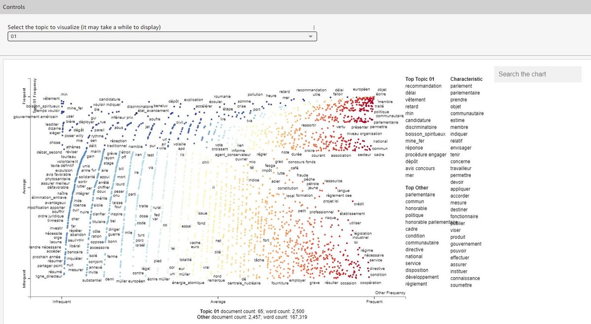
Alternative topics visualisation
The alternative topics visualisation is another way to look at the usage of words across topics, and across all documents in the corpus. This graph maps the terms used in this topic along two axes. The vertical axis measures how frequently the terms appear in this topic, while the horizontal axis indicates how frequently these terms appear in all documents.
 The Alternative Topics Visualization is another way of looking at the frequency of words across the Archives Unit corpus.
So, for example, on the left hand side we see words that appear frequently in a specific topic, but not generally across motions for resolutions and parliamentary questions, while on the right hand side we see terms that frequently occur. It also highlights terms that may not appear frequently in the text but, since they appear rarely across all documents, may still be of interest.
The most common terms for the topic, and the dashboard generally, are summarized on the right-hand side.
For further information about the dashboard terms, the dataset info tab gives the definitions of the terms used.
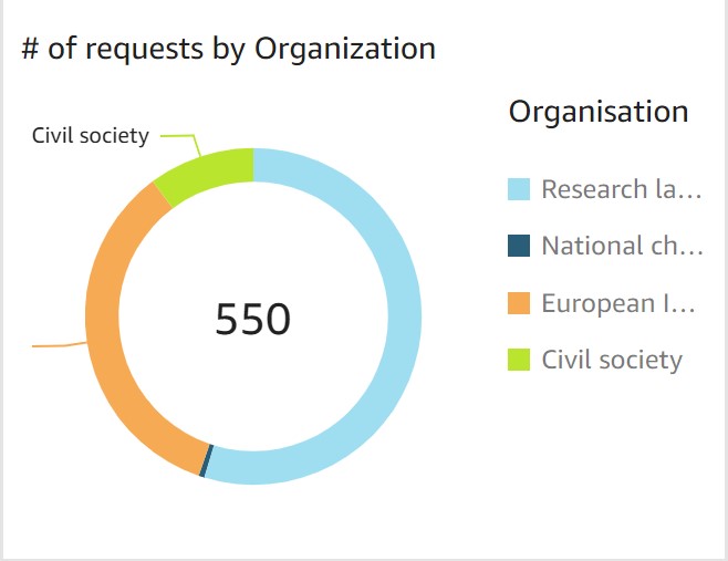
 A data visualisation produced by the Archives Unit dashboard. To export any visualisation, select it, open the menu option that appears on the top right-hand side and choose ‘Export to CSV’ or ‘Export to Excel’ (Note: Exporting to XSLX is only available for pivot tables and table charts).
 A data visualisation produced by the Archives Unit dashboard. To export any visualisation, select it, open the menu option that appears and choose ‘Export to CSV’ or ‘Export to Excel’ (Note: exporting to XSLX is only available for pivot tables and table charts).